Home / Email signature examples / Email signature banner
Email signature banner creator (plus beautiful templates and design examples)
Learn how to add the best email banner for Gmail, Outlook, Yahoo, MacMail and more.

Short answer
What is a good email signature banner?
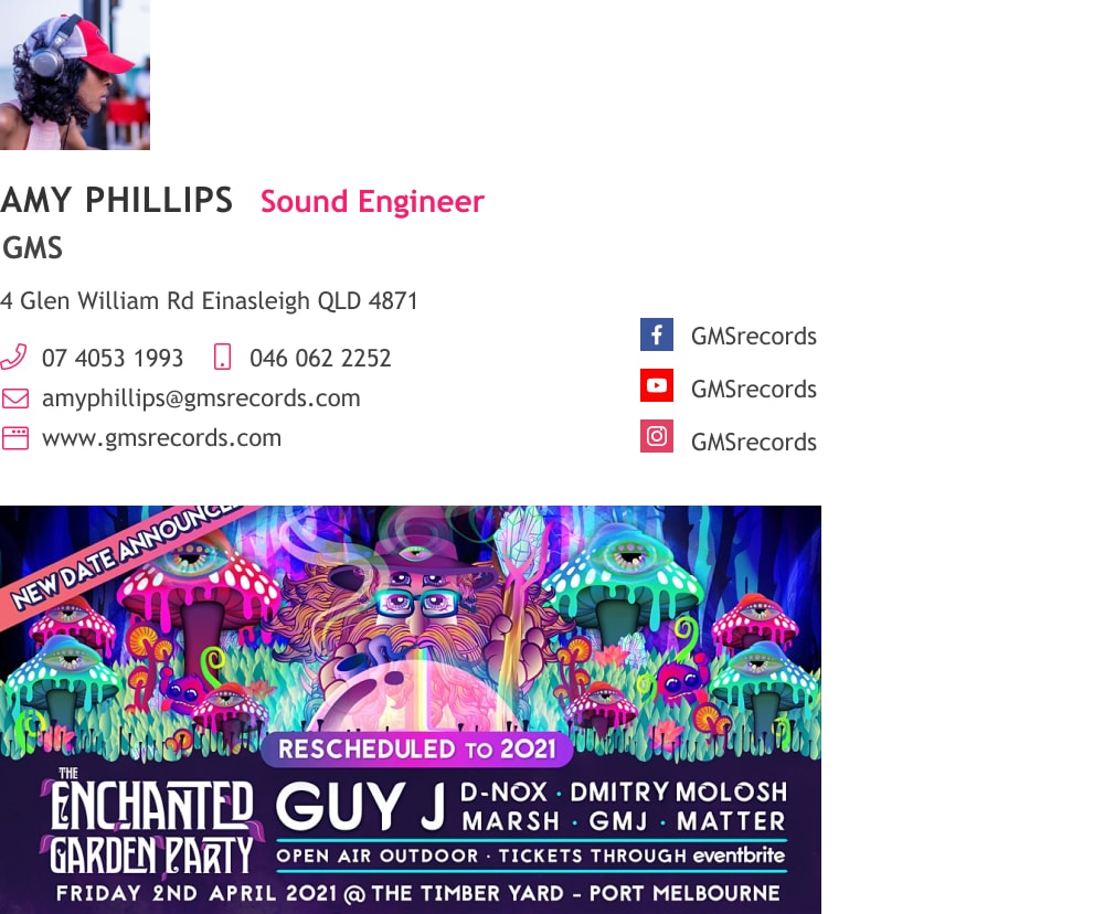
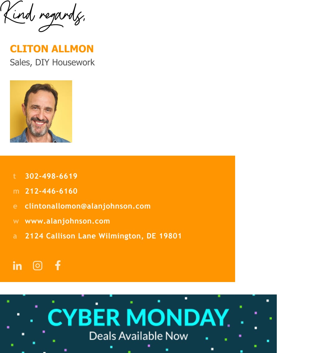
An email signature banner is an image you add to your email signature with a short message to your readers. Signature banners usually offer discounts, support or a way to contact your business. Signature banners don’t have a “right” size. Their size should be the same length as your signature block and change responsively, according to the recipient’s device or screen size. You can create a responsive signature banner with an email signature banner maker.
How to add a banner to your email signature
You have two ways for adding a banner to your email signature:
1) Manually add a banner directly to your email platform. You can find the instructions for most email types in the links below:
2) Use WiseStamp’s email signature banner maker. Simply choose from our Predesigned banners (or upload your own by choosing “Upload my banner“). This would be the easiest way.
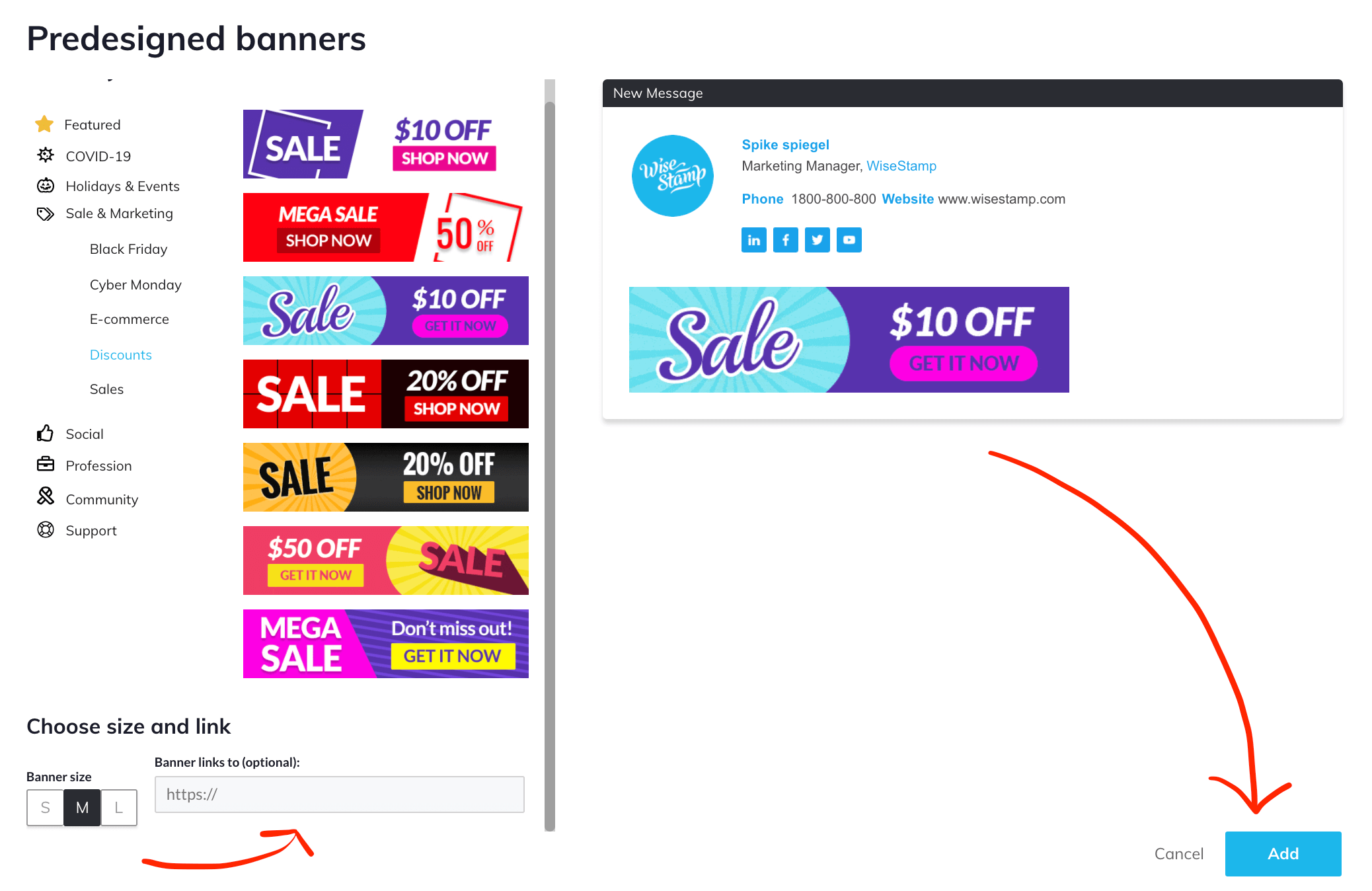
WiseStamp email signature banner maker
With our email signature banner maker you’ll have all these categories, full of pre-designed banner options to choose from:
- Featured banners
- COVID-19
- Holidays & Events
- Sale & Marketing
- Social
- Profession
- Community
- Support
How to make the best banner email signature (examples & tips)
Using a banner in your email signature will let you capture the attention of your email readers. Done right, your signature banner can drive sales with every email you send.
WiseStamp banner add-on is designed to maximize attention. If you haven’t added a banner to your signature already, this post will help you set one up right now and make it count.
Take a look at this eye-catching marketing banner example:

1) Pick and choose from predesigned signature banners
You really don’t have to go through the hassle of designing your own signature banner. There are enough beautiful ready-made email signature banners to go around. We have galleries full of banners for any occasion. You can add the banner you like to your email signature with a simple click and give it a link to your website.
Checkout more banners in our most popular banner galleries:
- Christmas banners
- Black Friday banners
- Holiday banners
- Cyber Monday banners
- Halloween banners
- Thanksgiving banners
- New-years banners
- Women’s day banners
2) Make an effective signature banner
- Have a clear call to action – meaning that you have to state a desirable offer to your prospects in simple words and in as few words as possible. Each word should add value and the entire sentence should be short and sweet.
- Make the banner clickable – it’s best to add a link to a landing page you know will convert new visitors to clients
- Make the banner stick out – use a solid color, use a GIF to add some motion, or simply make it big.
- Make the text legible – simply put, make it visually easy for people to read.
3) Add a call to action to your signature banner
You’ve probably included a professional headshot or your company logo in your signature already. Adding a banner to your signature is another opportunity to capture attention and provide a visual representation of what you have to offer.
For example, you can use a banner image to show off your product or services, but to get people to click your banner, you need to do something more than show them attractive visuals. Let’s see a bad example and a good example:
Good example
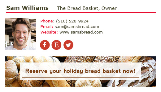
With just a tiny snippet of text, you can magically turn your banner into a powerful call to action that prompts people to buy your product.
A call to action should be clear and concise, and reflect the spirit of your business. Remember, including words and phrases like “free”, “50% off,” or “limited time offer” in your call to action encourage people to click.
That’s a good example of call to action signature banner.
Bad example

That bread looks good, right? But the image is just sitting there for people to admire. A truly effective banner is more than a pretty, pretty image. To truly get your point across (in this case, “buy my bread”), all you need is an additional three or four words.
This banner signature will most likely fail to generate sales.
4) Link from your signature banner
Any link you add should correspond to your banner’s content. If, for example, your banner displays a specific pair of shoes, the link should take you to the sale page of that exact pair.
How to size you signature banner
- Size your image the way you want it to appear in the signature.
- Create an image URL for the image (if you don’t have your own webspace, you can create an image url with a tool like TinyPic).
- Paste the URL in the “Custom HTML” app.
How to design your email signature banner
Now that you know the technical aspects of adding a banner to your email signature, WiseStamp’s graphic designer would like to help you take your banner to the next level by giving you her top three banner design tips for creating the banners for the best email signatures:
1) Think of your banner as a sort of name tag
When we’re writing our name on a nametag, most of us use a black marker and write our name in easy-to-read, clear letters. Colorful, glittery, ink and huge letters would be overpowering in a way that would distract from the point – helping people remember your name.
The same goes for your banner. Make it clear and clean so that the point – buying your product – is obvious. Make sure the banner text is readable (pt. 10 and larger) and DON’T use script or very thin fonts.
2) Be consistent in your branding
Stay true to your brand. Your banner is a member of your branding family, so be consistent with your colors and fonts. If you haven’t worked on branding your images already, consider working on your brand before you design your banner (these tools will be a huge help).
3) Keep it simple
Too many messages and too much imagery may confuse the viewer. You won’t miss the mark if you follow the axiom: “One message, one picture, one color”.

The benefits of adding a banner to your signature
Why create a banner? A well-composed banner can and will generate sales for you.
As humans, our eyes are wired to search for and focus on images. Research shows that most of us think in pictures, and 80% of what we see is retained by the eye (as opposed to the 10% of words that we remember when we read).
The bottom line is that images grab our attention and are more memorable to us than simple text. And therein lies the power of banners.
In its simplest form, a banner is an image that appears at the bottom of your email signature. A truly effective, well-designed banner allows you to highlight and link to your upcoming sales, events, special offers, and whatever else you’d like to promote.
- Email signature examples
- Cool email signatures design
- Minimalist email signature design
- Simple email signature design
- Clickable link email signatures
- Disclaimer email signatures
- Email signature quotes
- Green signature footers
- Banner email signatures
- Social media icons email signatures
- Link Instagram to signature
- Add Linkedin to email signature
- Animated GIF signatures
- CTA email signatures
- Link Google Maps to signature
- Email sign off examples
- Video email signatures
- Personal email signature
Free email signature generator
Popular features:
- 1-Click setup in your email
- Designed template options
- Add-ons for every need
- Email signature examples
- Cool email signatures design
- Minimalist email signature design
- Simple email signature design
- Clickable link email signatures
- Disclaimer email signatures
- Email signature quotes
- Green signature footers
- Banner email signatures
- Social media icons email signatures
- Link Instagram to signature
- Add Linkedin to email signature
- Animated GIF signatures
- CTA email signatures
- Link Google Maps to signature
- Email sign off examples
- Video email signatures
- Personal email signature

