Home / Email signature design / logo size
Email signature logo size: The complete guide
Logo too big? Slow loading? Blurry? Use this complete email signature logo size guide to ensure your email signature always looks professional.
It’s fair to assume that your professional email signature, the one which you use to present your business to your email contacts, has your logo on it. The logo in your email signature serves as a visual representation of your brand and can also add a personal touch to your messages.
But what size should your logo be? If your logo appears blurry or too big on certain platforms, or if it takes too long to load, it can definitely look unprofessional to your clients. So we’ve put together a guide with everything you need to know to create an image of the best size for an email signature logo.
Read on!
What’s on this page
- What factors go into the best logo size for an email signature?
- Dimensions (width/height) and how they impact your logo
- Adjusting your template to your logo’s orientation
- How to resize the logo for your email signature (i.e. fix the dimensions)
- What is the ideal resolution for an email signature logo
- File weight and how it impacts your logo
- Summing it up
What factors go into the best logo size for an email signature?
There are multiple size factors that affect the display of your logo:
- Dimensions (width/height)
- Resolution
- File weight
- File type (jpeg, png, gif, etc.)
Let’s go through them one by one and explain what can happen when your logo image is the wrong size, and how to create an ideally sized logo image.
Dimensions (width/height) and how they impact your logo
The dimensions of a digital image are measured in pixels: how many pixels wide by how many pixels high.
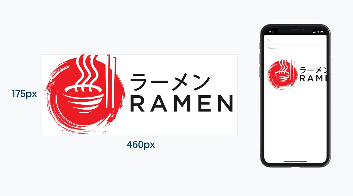
This logo, for example, is 460x 175 px (460 pixels wide by 175 pixels high):
If your email signature logo size in pixels is too big, it will take up too much room on the screen, especially on mobile devices, potentially pushing all the other important information in your email signature (contact information, social links, CTA banner) down to where no one will scroll for it.
Example:
Considering smaller screens
You should also be mindful that many people open their emails on a mobile device. Most mobile screens are roughly 400 pixels wide. If your logo is too big for this size of screen, it will appear broken on a mobile device.
We recommend keeping your logo as small as you can in your email signature while maintaining a good balance between your signature’s components.
Adjusting your template to your logo’s orientation
The orientation of your company’s logo should be a determining factor in deciding the layout of your email signature. Your logo should be balanced with the rest of your signature’s details.
Say your logo is horizontal, in this case, a vertical signature layout will work much better than a horizontal one, since your details would be placed evenly below your logo. That’s unless you’re going for a minimal signature with only the bare details.
If you still wish to have a horizontal signature layout with your horizontal logo, our suggestion would be to resize your logo to a smaller size and add a frame or white space around it, which will make it look even smaller and create balance with all the other elements.
In the same way, a vertical logo would work better in a horizontal layout. If your logo is more along the lines of a square or a circle, then you should align the height according to your signature’s template details.
See examples of horizontal & vertical logos in an email signature
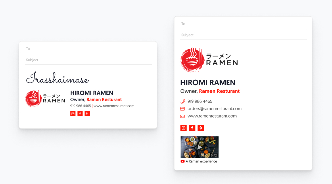
Examples of horizontal logos with apps in email signature
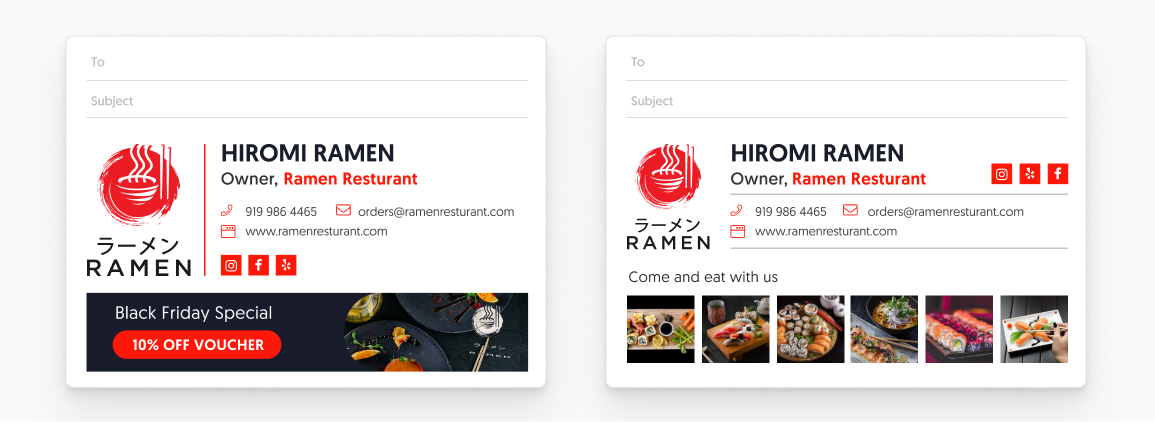
Examples of vertical logos and apps in email signature
How to resize the logo for your email signature (i.e. fix the dimensions)
Resizing an image is pretty simple. You can even do it in a simple drawing program like Paint. Here’s how.
1. Open the image file in an image editing program (e.g Figma, Photoshop, or a free one like Pixlr) and click “Crop and Rotate”.
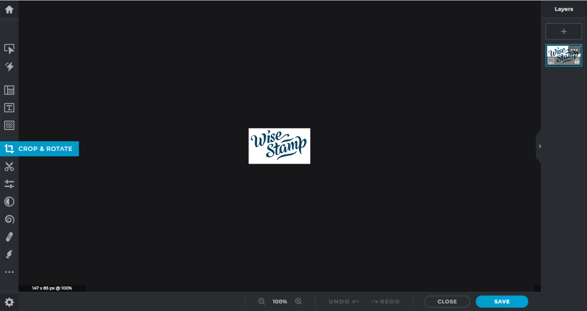
2. Resize your image according to pixels, and input the width you want the resized image to be.

3. Voila! Your logo image is exactly the size you want!

4. Don’t forget to save your resized image.
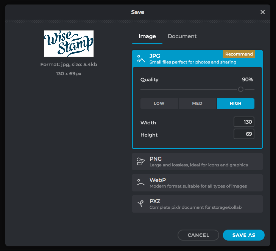
In this case, it’s 200 x 54 px. Don’t forget to save it!
Sometimes your email platform will allow you to resize the image while you’re setting up your signature, like with Gmail:
This is not an ideal way to change your Gmail signature logo size, because:
- The resizing options are limited (e.g. Small, Medium) instead of specific, down-to-the-pixel numbers.
- Your signature now contains your original image, with its original dimensions, plus some HTML code that instructs the recipient’s email client to display it with a different set of dimensions. Some email clients will ignore those HTML instructions, and just show whatever the original image was. So preferably you want the original image you upload to be your ideal display dimensions.
For these reasons, we strongly recommend you resize your image in an image editing program before adding it to your Gmail email signature.
What is the ideal resolution for an email signature logo
The resolution of your logo determines the clarity and quality of the image, so it’s important to use a high-quality image with a suitable resolution.
A general rule is to make your signature logo no larger than 150-200 pixels wide, 70–100 pixels high for a horizontal logo, and the opposite for a vertical one.
For a square block, we recommend 150-200 by 150-200 pixels. For the best results, the image should be optimized for a web resolution of 72dpi, so it displays correctly.
We realize these sizes are quite small, making it difficult to make your logo look sharp, so we recommend exporting your logo at least x2 the size you would like it to appear.
For example, if you want your logo to appear at 150×150 pixels, try to save it at least at 300×300 pixels, while maintaining a low file size.
When you optimize the image for web use it’s better to work with a larger file and shrink it, than to work with a smaller sized file that doesn’t look as sharp.
How to fix your logo image resolution
Ideally, your logo should be in a vector file format. These image formats can scale themselves on the fly, so they aren’t stuck with a set amount of pixels and they’ll therefore always look sharp, no matter the display size. Vector file formats include SVG, EPS, AI, and PDF. (Yep, PDFs are vector files!)
Even if your email client doesn’t enable you to upload vector files (many will only accept non-vector images like PNG, JPG, and the like), having your logo in a vector file will still help you.
You can open it in a basic image editing program like GIMP (or even upload it to Canva, for some vector formats), resize the logo image, and save it as a PNG or JPG
File weight and how it impacts your logo
Size is not only a matter of horizontal and vertical dimensions. It’s also a matter of weight. Larger files load more slowly and can potentially trip email spam filters.
On the one hand, you want your logo to look sharp, but on the other hand, you want the file size to be as small as possible. So it’s about finding the right balance between the biggest resolution and the smallest file size.
While research done by Email on Acid shows that large individual image sizes don’t have a significant effect on an email being categorized as spam (as opposed to large HTML email files, which do), MailJet recommends keeping images under 120KB so that your recipients don’t have a negative user experience, or use up data in limited mobile data plans.
How to fix your file weight: image compression
Compressing your email signature logo image is the way to make your logo file weigh less but stay looking good. Many file compression tools can be found online, both free and paid.
TinyPNG, for example, is a well-known online image compression service that lets you compress up to 20 images (max 5MB each) for free.
Even if your logo file is relatively light already, compression can usually only help.
Logo that includes an icon and text
If your logo consists of a shape and under it or beside it a piece of text, and it doesn’t fit your chosen signature layout, then consider getting rid of the text, that is if your brand guidelines are flexible enough to allow it. Now your logo will consist of a large square icon that will enable you to balance your signature elements better.
Summing it up: The simple way to get the best logo size for your email signature
Resizing, resolution, compression… it can be a lot to handle just to get the right size logo for your email signature.
Using the WiseStamp email signature generator, you simply upload your logo and all the sizing issues are taken care of from within the generator. When it’s all done, the entire signature is seamlessly integrated with your email platform.
Add and resize an email signature logo with WiseStamp

Remember, your email signature is the last thing your recipient will see. Your logo will be the impression of your company that stays with him.
Follow the image size for email signature guidelines above, and you’ll make sure that impression will be a good one.
- Email signature design guides
- Email signature design
- Email signature size
- Email signature colors
- Email signatures fonts
- Email signature logo size
- Email signature design examples
- Email signature examples
- Signature templates
- Email signature sign offs
- Email signature banner design
- Cool email signatures
- Personal email signature
- Basic email signatures
- Minimal email signatures
Free email signature generator
Popular features:
- 1-Click setup in your email
- Designed template options
- Add-ons for every need
- Email signature design guides
- Email signature design
- Email signature size
- Email signature colors
- Email signatures fonts
- Email signature logo size
- Email signature design examples
- Email signature examples
- Signature templates
- Email signature sign offs
- Email signature banner design
- Cool email signatures
- Personal email signature
- Basic email signatures
- Minimal email signatures
