Home / Email signature design / colors
Email signature colors: How to make your email signature stand out
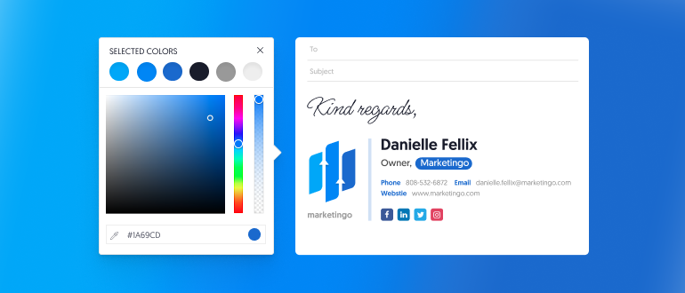
A good email signature should be memorable and strike a chord with your clients and prospects. That’s why it’s essential to make sure your signature looks professional and sleek – and one of the best ways to do that is to choose the perfect email signature colors and color combination.

In this article, we’ll break down the different components of an email signature to discuss their preferred colors, and then provide tips for choosing the perfect color combination for your email signature. Finally, we’ll look at examples of colorful email signatures to give you some inspiration.
What’s on this page
The different components of an email signature
When deciding on the right colors for your email signature, it’s important to consider all the different components of your signature.
An email signature typically includes your name, job title, company name, phone number, and email address. Most signatures will have decoration lines, a personal image, and/or a company logo, while some people may add social media icons, handwritten sign-offs, campaign banners, CTA buttons, schedulers, or many other available apps.
When it comes to your signature’s color palette, all of these possibilities should be considered, from your choice of font all the way down to the color of your social media icons. Picture in mind how all of your signature’s components will be arranged and then decide on a solid color combination that would fit everything harmoniously.
Tips on choosing the right color for your email signature
When it comes to choosing the right color for your email signature, there are a few things you should consider. Here are some essential tips.

1. Make sure it matches your brand
To really make a good impression, it’s important to make sure your email signature color matches your brand identity. Your signature color should be consistent with the colors used in your logo and website. This can help create a sense of visual continuity and ensure that your branding is reflected in all your communications.
Usually, every brand has at least 3 colors in its color scheme: a primary, a secondary, and a tertiary color, which can also be a shade or a hue of the primary/secondary color. Quite often, the tertiary color’s role is to support the primary and secondary colors by “setting the stage” for them to stand out. When creating your email signature, you would normally use your brand’s primary color for the most important elements.
If your brand’s colors are not set in stone, you can use your email signature creation process as an opportunity to understand which colors better reflect your brand personality or your business needs.

2. Keep the right contrast for font readability
Another important factor to consider when choosing your email signature color is the contrast between the background and the font. You want to make sure that the text is easy to read and that it stands out from the background.
If your primary brand color is too bright, you may need to consider a supporting darker color for your signature’s text. But it doesn’t have to be carbon black. If you’re unsure which colors to use, try using online tools like Adobe Color or Coolors. These color palette generators help you understand better which colors work best with your brand color to create the most easy-to-read contrast.

3. Use color to focus your reader’s attention
On that note, it’s important to remember that color is a powerful tool to focus your reader’s attention. You can use that to highlight the important parts of your signature, such as your name, contact info, website, or logo.
For example, consider whether you want your recipients to notice your name or your job title first, and highlight that field with your primary brand color. By using the right color combination you can draw the eye to the components which are more important to your marketing or branding needs.

4. Don’t use too many colors
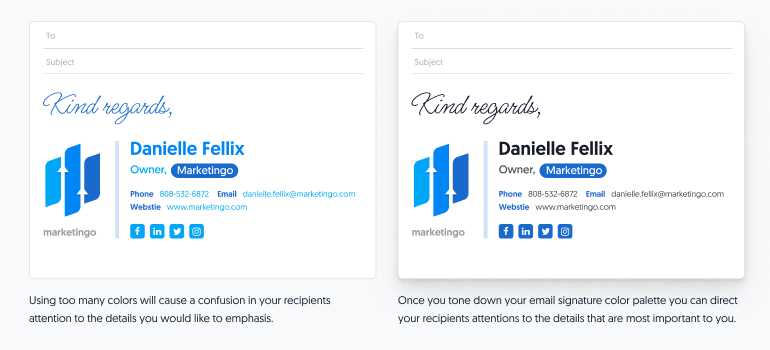
Choosing the right color combination for your email signature can be tricky. You want to make sure it’s eye-catching and memorable, but you don’t want to go overboard. Too many different colors in your email signature can be overwhelming or even distract your viewers’ attention from the main details. Instead, stick to two colors that complement each other.
An elegant signature would have a main primary color and then a secondary accent color, and maybe also different shades, tints, or hues of the same colors. The details you wish to highlight will be in your primary color, and all the rest in the secondary color.

5. Use elements to make it stand out
There are many ways to make sure your signature colors stand out, and one of them is by using design elements in your signature wisely. To make your brand color pop, the wise thing to do is to choose the right template with the best layout for your signature, and then consider which elements can enhance your brand colors.
For example, you can use vertical or horizontal lines to cement the brand presence in your viewer’s perception. You can make them wide or narrow as you see fit, in order to support the brand feel of your signature. You can get the same effect by using a background block of your brand color.

6. Your CTAs should be aligned with your colors
Your email signature may be used to enhance your marketing efforts with banners, event announcements, CTA buttons, and more. You want to make sure your signature looks great no matter what you add to it. So when choosing a color for campaign banners or for any other CTA for that matter, pick one that works well with your main color combination.
For example, if you’re using your primary brand color to highlight your name or job title, then use your secondary brand color for the CTA. That will guide your viewer’s eyes to where you want him to look.

Conclusion
Your email signature is an important part of your brand identity. It’s like a digital business card that helps your recipients remember who you are and what you do. Additionally, it can serve as an effective marketing channel for your business or your personal brand.
A carefully chosen color combination for your email signature can make a huge difference in how your emails are received. By following these tips, you can make sure that your email signature catches the eye while also looking professional.
- Email signature design guides
- Email signature design
- Email signature size
- Email signature colors
- Email signatures fonts
- Email signature logo size
- Email signature design examples
- Email signature examples
- Signature templates
- Email signature sign offs
- Email signature banner design
- Cool email signatures
- Personal email signature
- Basic email signatures
- Minimal email signatures
Free email signature generator
Popular features:
- 1-Click setup in your email
- Designed template options
- Add-ons for every need
- Email signature design guides
- Email signature design
- Email signature size
- Email signature colors
- Email signatures fonts
- Email signature logo size
- Email signature design examples
- Email signature examples
- Signature templates
- Email signature sign offs
- Email signature banner design
- Cool email signatures
- Personal email signature
- Basic email signatures
- Minimal email signatures
