The Ultimate Guide to Email Design Trends, Tips, and Best Practices 2024
Unlock the power of effective email design. Learn about the latest trends and best practices to level up your email marketing game.
For many, email marketing seems as outdated and old-fashioned as a dial-up tone or (non-smart) flip phone.
The reality of the matter is email marketing is doing very well. So much so that it is still considered one of the highest ROI channels in the world – with a whopping 40% Return on Investment across multiple industries!
People receive up to 120 emails every day, whether work emails or promotional emails. notifications, and others. When you are surrounded by so much digital noise, it’s hard to keep up with the latest email design trends and best practices.
For brands, this means they have to level up their email marketing from subject line to signature – and email design plays a massive role in most of these aspects.
Want to learn more about creating email designs people don’t just not ignore, but feel engaged with?
We have put together a guide on some of the most crucial elements of email design, so keep reading and find out more.
Key components of effective email design
Emails are more than just electronic messages. Used properly, they can be a tool for improved communication, better messaging, healthier marketing, and more. The key to unlocking their potential lies in making the right design choices.
Although the elements of good email design are complex, they can essentially boil down to a handful of elements:
Layout and Structure
A well-organized layout is crucial for guiding readers through an email and ensuring the content is easily digestible. Common structures include single-column and multi-column designs, with single-column layouts often providing a straightforward and streamlined experience that enhances readability on mobile devices.
In contrast, multi-column designs can effectively present more content but may complicate the reading experience if not executed properly. An effective layout should prioritize clarity and logical flow, making it easy for users to navigate and engage with the email’s content.
Here’s how to choose the right layout and structure for your emails:
- Single-column layout: Ideal for newsletters and updates, this layout focuses the reader’s attention on a single stream of content, enhancing readability and engagement on mobile devices.
- Multi-column layout: Best suited for promotional emails featuring multiple products or services, this design allows for more information to be presented at once, making it visually appealing for quick browsing.
- Grid layout: Great for showcasing portfolios or galleries, a grid layout provides a balanced view of images and text, making it easy for readers to scan and find what interests them.
- Asymmetrical layout: Useful for creative campaigns, this layout breaks conventional design rules to create a unique and modern aesthetic that grabs attention and fosters curiosity.
- F-shaped layout: Effective for content-rich emails, this structure mirrors how users naturally scan text, guiding the reader’s eye.
Typography
Choosing the right typography is essential for enhancing readability and maintaining brand consistency. Fonts should be selected carefully, considering factors such as legibility across various devices and platforms.
Also, font sizes should be large enough for comfortable reading on all screens, while styles should reflect the brand’s personality. When you establish a clear hierarchy through the use of different font weights and sizes, you help guide readers’ attention, make important information stand out, and enhance the overall visual appeal of the email.
Here are some examples of how typography could be used to enhance email design:
- Sans-serif fonts: Often used for their clean and modern appearance, sans-serif fonts are a popular choice for headlines and body text alike. They are highly legible and work well on both desktop and mobile devices.
- Serif fonts: Traditional and elegant, serif fonts can add a touch of sophistication to an email’s design. They are often used in headings or as accents to contrast with sans-serif body text.
- Script fonts: For a more playful or artistic vibe, script fonts can add personality to an email design. However, they should be used sparingly as they may not be suitable for all devices.
- Font pairing: Combining different fonts in an email design can add visual interest and create a unique look. However, make sure the fonts complement each other and maintain consistency throughout the email.
Color Schemes
Color plays a significant role in shaping user perception and reinforcing brand identity. A well-chosen color palette can evoke specific emotions and reactions, enhancing the message’s effectiveness. Aside from keeping colors on brand, you can also use them to enhance your message. For example:
- Red can create a sense of urgency or excitement
- Blue inspires trust and credibility
- Green conveys growth and freshness
- Orange is often associated with creativity and innovation
Imagery and graphics
Visual elements such as images, videos, and graphics are powerful tools for capturing attention and conveying information quickly. It’s essential to use high-quality visuals that align with your brand’s aesthetic and message. Avoid overcrowding the email with too many images, which can distract from the primary content or slow down loading times.
Don’t take this the wrong way. Emails without images and graphics can be very successful (even as plain texts), But generally, emails with visuals are more engaging and memorable.
Current trends in email design for 2024
Choosing your design based on trends isn’t the best idea, but it can help you find fresh, effective angles to convey your message visually.
Here are some of the email design trends you should consider for 2024:
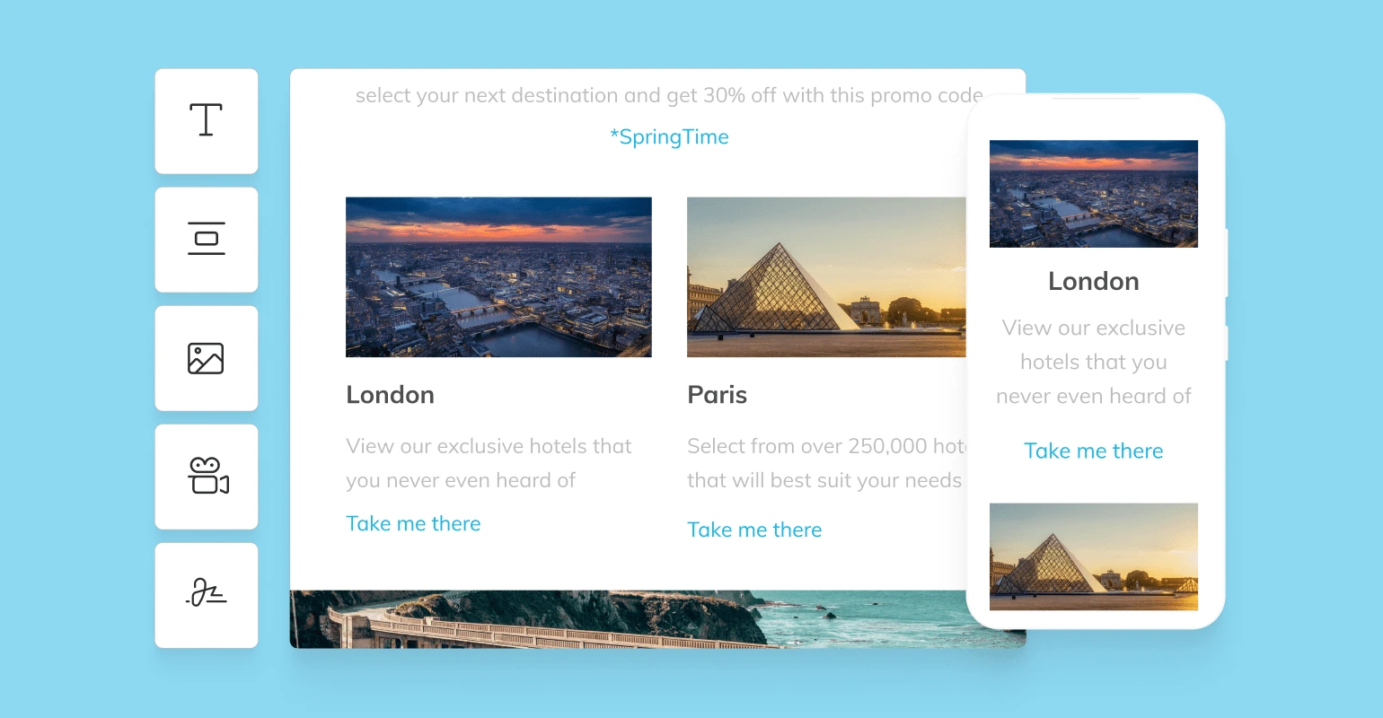
Interactive and engaging elements
Interactive features can help you engage your audience and create a more personalized experience. Examples include interactive quizzes, polls, and games embedded directly into the email. These elements can increase user engagement and make your emails stand out in a crowded inbox.
Examples of interactive features you can add to your emails include:
- Carousels
- Polls
- Hover effects
For example, take a look at how McDonald’s included an invitation to a game of Monopoly Go in their email:
Or how RIND Snacks incorporated this fun, quirky poll to assess their audience’s engagement (and help keep their email list clean):
Personalization and dynamic content
Dynamic content plays a crucial role in crafting personalized email experiences that resonate with individual recipients. In fact, it can make such a huge difference that it can drive as much as (if not more than) 22% increase in ROI.
When you use customer data, marketers can tailor content based on factors such as past purchases, browsing history, and engagement levels, ensuring that each email feels relevant and customized.
For instance, if a customer frequently purchases fitness gear, an email can feature targeted product recommendations, exclusive discounts, or tailored content that aligns with their interests.
To effectively leverage customer data for enhancing email relevance, consider these tips:
- Segment your audience. Divide your email list into distinct segments based on demographics, purchase history, and engagement patterns. This allows you to send tailored messages to each group, increasing the likelihood of engagement.
- Employ behavioral triggers. Implement automated triggers based on customer actions, such as cart abandonment or product views. Sending timely follow-ups with relevant content can significantly improve conversion rates.
- Incorporate user preferences. Offer options for subscribers to customize their email preferences. Collecting data on their interests enables you to serve content that aligns with their specific needs, fostering a stronger connection.
- Test and optimize. Regularly analyze engagement metrics to refine your dynamic content strategies. A/B testing different personalized elements can help you identify what resonates best with your audience, allowing for continuous improvement.
By harnessing the power of dynamic content and effectively making use of customer data, marketers can create compelling email experiences that drive engagement and conversions, elevating their overall email marketing strategy.
Here’s an example from Nike on how personalization and dynamic email design could look:
Minimalist and mobile-first design
Minimalist design enhances readability and reduces cognitive load for the reader, making it easier for them to digest information quickly. By using ample white space, clear typography, and a limited color palette, minimalist designs can create a visually appealing experience while focusing the recipient’s attention on the most important content.
Minimalist design is also great for mobile devices because it helps you optimize your emails for responsiveness across various screen sizes, enhancing your audience’s user experience. And if you’re wondering if this is worth it, know that more than 43% of all emails are opened on mobile devices. No matter how you look at this, mobile responsiveness is very important.
Here’s an example of a minimalist email design that’s anything but boring:
AI and automation in email design
To say AI has taken over the world would be the understatement of the decade (if not century). Artificial intelligence in In email design can assist you in creating personalized content and automating processes, such as dynamic product recommendations and hyper-tailored content.
AI-powered email design solutions can also help you optimize your campaigns by analyzing customer data and identifying patterns to predict what type of content will best engage them.
For example, an AI-driven email platform can analyze a subscriber’s past purchases and browsing activities to recommend similar or complementary products, increasing the chances of conversion.
With automation capabilities, AI can help streamline your email design process by automating repetitive tasks such as subject line creation, A/B testing, and even generating personalized images for each recipient. This enables marketers to focus on crafting compelling messages while leaving the technical aspects to the machine.
Inclusivity and accessibility
The growing emphasis on inclusivity and accessibility in email design recognizes the importance of creating content that is usable for all individuals, including those with disabilities.
Adopting accessible design practices not only broadens your audience but also demonstrates a commitment to social responsibility. To enhance accessibility in your email campaigns, consider the following tips:
- Use alt text for images. Providing descriptive alt text for images ensures that screen readers can convey the information to visually impaired users. This text should be concise and accurately describe the image and its purpose within the email.
- Ensure sufficient color contrast. Poor color contrast can hinder readability for those with visual impairments. Aim for a minimum contrast ratio of 4.5:1 for normal text and 3:1 for large text to ensure your content is readable for everyone.
- Use clear and simple language. Strive for straightforward language that is easy to understand. Avoid jargon or complex vocabulary, making your messages accessible to a wider audience.
- Structure content with headings and lists. Use headings, subheadings, and bullet points to break up text and create a logical flow. This helps users, especially those using screen readers, navigate their email more efficiently.
- Test for accessibility. Use tools and software that can evaluate the accessibility of your email designs, helping you identify areas for improvement.
By incorporating these practices, you can ensure your email marketing efforts reach and resonate with all users, fostering an inclusive environment and enhancing your brand’s reputation.
Best practices for designing effective emails
Aside from everything mentioned in this article, it is worth considering the following best practices as well:
Clear and compelling CTAs
A well-crafted call-to-action (CTA) is essential in guiding recipients toward a desired action, whether it’s making a purchase, signing up for a newsletter, or downloading a resource.
To design CTAs that stand out and encourage clicks, consider the following tips:
- Be clear and concise. Use straightforward language that precisely conveys the action you want the user to take. Avoid jargon or complex phrases that might confuse the reader.
- Create a sense of urgency. Phrases like “Limited Time Offer” or “Act Now” can encourage quicker decisions and prompt users to act immediately.
- Use contrasting colors. Ensure that your CTA buttons stand out against the background by using colors that create clear visibility and draw attention.
- Position strategically. Place CTAs in visible and logical locations within your email, such as near the top or at the end of engaging content, making it easy for readers to find.
- Make it mobile-friendly. Design CTAs that are easily clickable on mobile devices—ensure they are large enough to tap without precision and spaced adequately from other elements.
- Test different designs. Conduct A/B testing to experiment with various CTA styles, wording, and placements. Monitor the results to find which combinations yield the highest engagement.
- Consider the user experience. Ensure that the action you’re prompting is seamless. For instance, if a user clicks the CTA, the subsequent page should load quickly and continue the user’s journey effortlessly.
Consistency with branding
Brand consistency is crucial in email marketing, as it helps reinforce brand identity and builds trust with your audience. One of the most effective ways to achieve this is through the strategic use of brand colors, fonts, and logos.
- Colors: Consistently applying brand colors in your email designs enhances cohesion, evokes emotions, and boosts recognition.
- Fonts: These play a significant role in communicating your brand voice. Choose a couple of complementary typefaces that reflect your brand’s characteristics, whether it’s modern, elegant, or casual.
- Logo: Incorporating your logo is vital for establishing brand presence. Position it prominently at the top of your emails or within the header, as this reinforces your identity immediately.
Keep in mind that these guidelines exist not just because they look good, but also because they are scientifically proven to influence consumer behavior. As such, make sure your brand’s design elements remain consistent across all marketing channels, including email.
Common mistakes and how to avoid them
If you want to create successful email designs, be aware of common mistakes and take steps to avoid them. Some missteps to watch out for include:
Overloading with information
Crowding your email with too much content, multiple CTAs, or irrelevant information overwhelms readers and often leads to them tuning out entirely. To avoid this mistake:
- Focus on one central message per email.
- Use a clear and concise subject line that accurately reflects the content.
- Prioritize essential information and use headings, bullet points, and images to break up text.
Neglecting mobile optimization
With more than half of all emails being opened on mobile devices, it’s crucial to ensure your designs are responsive and easy to read on smaller screens. Avoid
- Using small font sizes that make reading difficult on mobile screens.
- Forgetting to test your email design on different devices and email clients.
- Cluttering the design with too many elements, making it hard to navigate on mobile.
To prevent these errors, keep mobile optimization top of mind throughout the design process. Test your emails regularly on various devices and make adjustments as needed.
Using a single image
According to research, emails with images boost engagement by 10%. This might be reliant on your industry and audience, as well as the type of message you want to convey. All in all, images do tend to make your audience more likely to read and click.
And although it may be tempting to use a visually striking image as the focal point of your email, relying solely on images can create accessibility issues for users who rely on screen readers. Additionally, some email clients may block images by default, causing your message to appear incomplete.
To avoid these problems,
- Use a combination of text and images in your email design.
- Include alternative text (alt text) for images so that screen readers can describe them to visually impaired users.
- Use descriptive headings and captions to make up for any information conveyed through images.
Case studies and examples
Email design comes in many shapes and forms.
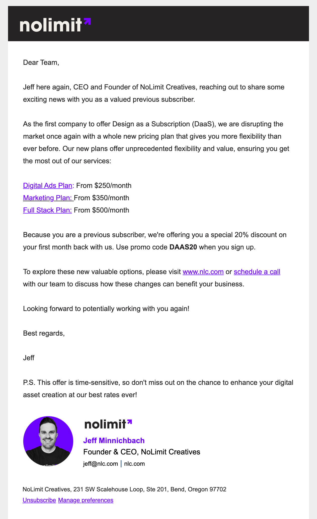
In some cases, it can be minimalist, but lively, like this NoLimit Creative email, for instance:
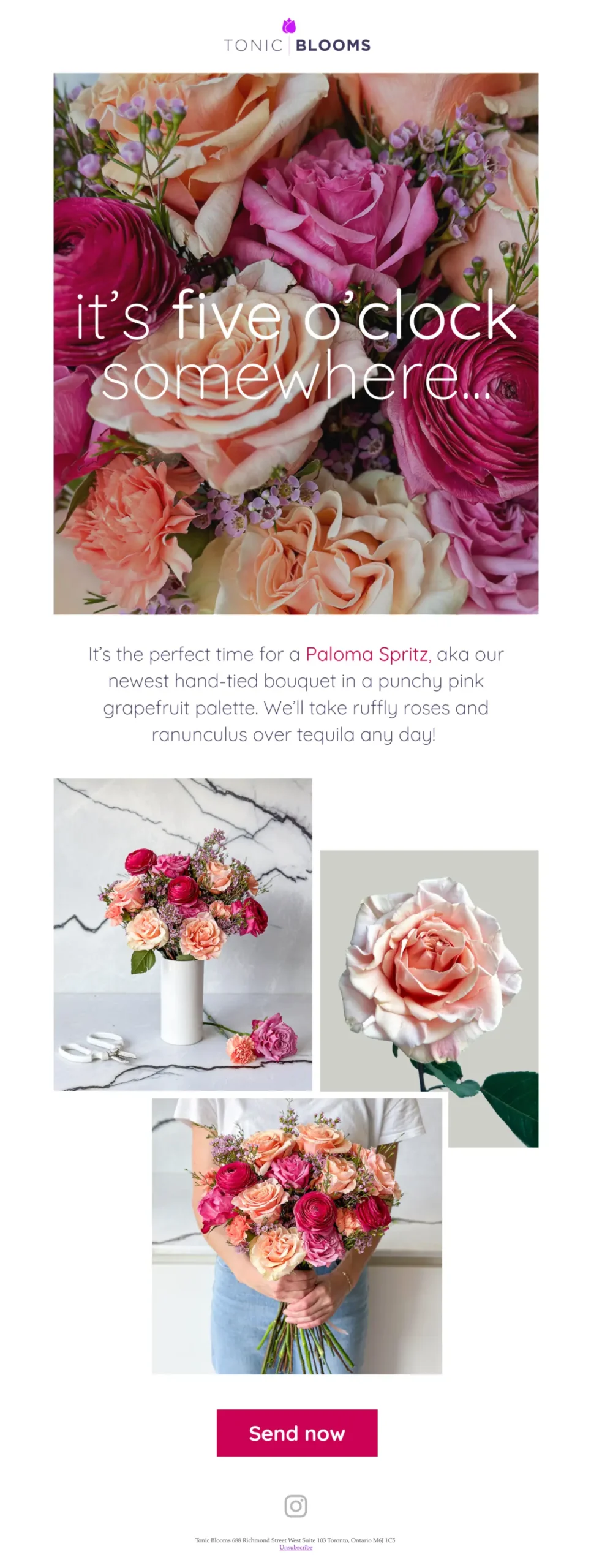
Some email designs feel like a party (see this Tonic Blooms one):
Some use blocks and keep things business. Zoom has a good example of this:
No matter where you stand on how email design should look like, remember it’s all about the crossroads between your brand and your audience.
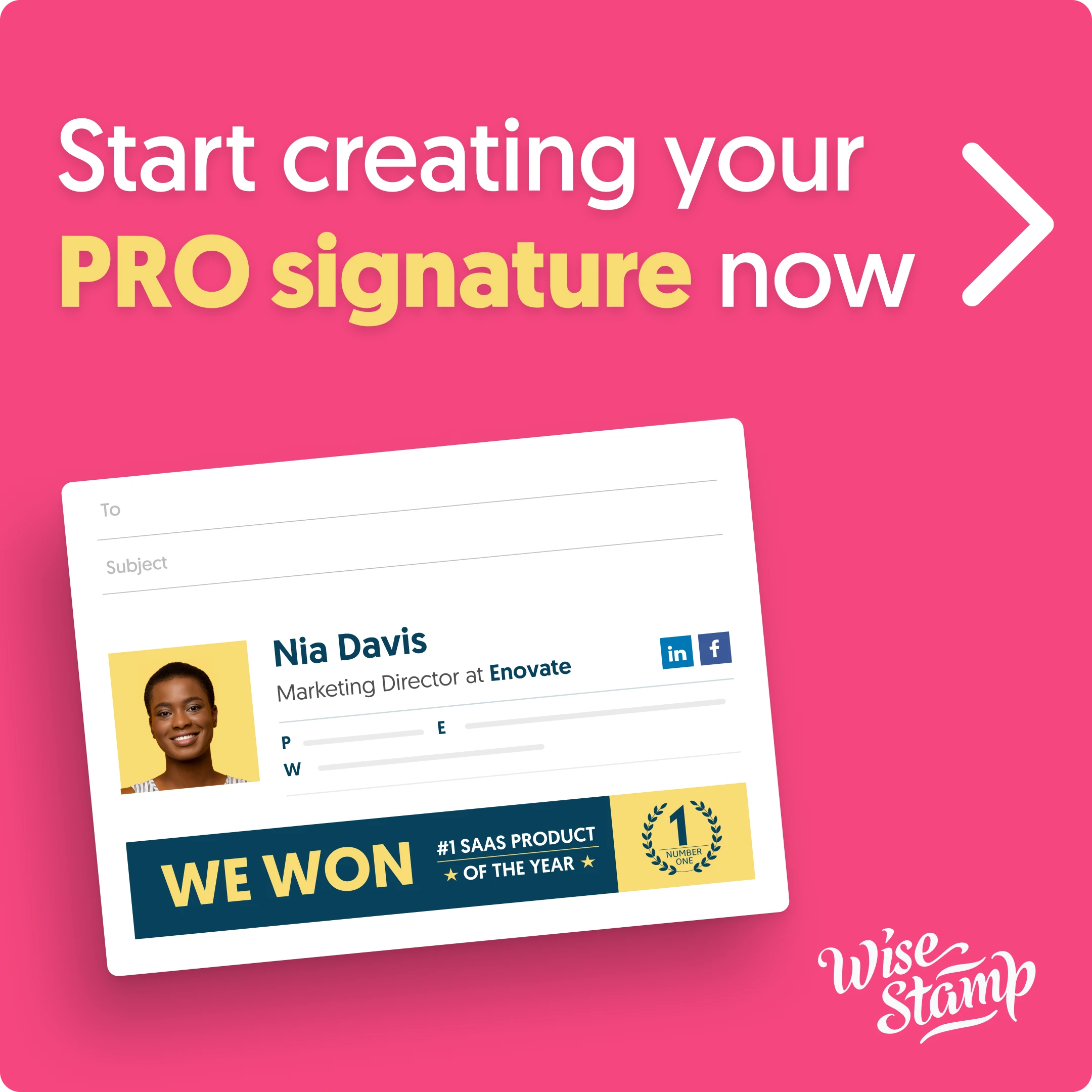
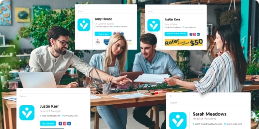
Email signature design
Email signature design may not be a top priority for many, but it can play a crucial role in creating a professional and consistent brand image. And while most marketing emails will not include an email signature, every other email your team sends – internally or externally – will include it.
Here are some tips for designing an effective email signature:
Keep it simple and clutter-free.
A clean, uncluttered design helps your recipients focus on the essential information. This approach enhances readability and ensures that your message stands out.
Use a maximum of two to three colors
Limiting your color palette to two or three brand-aligned colors maintains a professional appearance and strengthens brand recognition. Choose colors that complement each other and reflect your brand’s identity.
Include essential information
Providing this key information ensures that recipients can easily identify who you are and how to reach you. It also enhances your credibility and makes it easier for others to connect with you online.
Here’s some of the info to include:
- Full name: Clearly state your name to promote personal connection.
- Job title: Include your position to establish your role within the organization.
- Company name: Feature your company’s name for brand acknowledgment.
- Phone number: Provide a contact number for direct communication.
- Email address: Ensure recipients can easily reach you for follow-ups.
- Website URL: Link to your company’s website for additional context and resources.
- Social media links: Include relevant social media profiles to enhance engagement and connect with your audience.
- Professional photo: Incorporate a professional headshot to humanize the communication and add a personal touch.
Add a call-to-action
A thoughtful call-to-action can encourage recipients to take the next step, whether it’s visiting your website or following you on social media. This small addition can significantly boost interaction and engagement. This call-to-action could be:
- Visit our website – Direct recipients to explore more about your brand or services.
- Follow us on LinkedIn – Encourage connections on professional networking platforms.
- Join our newsletter – Invite recipients to subscribe for updates and exclusive content.
- Schedule a call – Provide a link for easy appointment booking for consultations.
- Check out our latest blog post – Promote recent content to drive traffic to your website.
- Connect with us on Instagram – Foster engagement on social media platforms.
- Download our free eBook – Offer valuable resources in exchange for lead capture.
- Share your feedback – Prompt recipients to engage and share their thoughts about your services.
- Join our webinar – Encourage recipients to attend your upcoming webinar or event.
Use a legible font size and typeface
Choosing the right font enhances readability and reflects your brand’s personality. Consistency in font style across your communications helps build a cohesive brand image. Some of the easiest-to-read typefaces include:
- Arial
- Helvetica
- Verdana
- Calibri
Conclusion
Email design may not be rocket science, but it sure is one of the most fun, creative, and impactful aspects of email marketing. There are, of course, some factors to consider (as pointed out throughout this article), but don’t allow yourself to perceive these best practices as “rules.” They are guidelines to help you create beautiful and effective email designs that align with your brand and resonate with your audience.
Keep experimenting, keep testing, and most importantly, have fun!